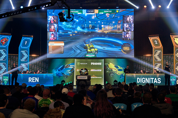
Dignitas: A Re-Rebrand Gone Right
In 2018 Dignitas rebranded from their circle alien logo to an Ancient Roman style’d owl to highlight the org’s history, but the rebrand was universally panned as a failure. Several years later, Dignitas changed course bringing back a modern version of their longtime icon ‘Digi’ to universal praise.
Why Logos Matter
Team Dignitas was founded in 2003 and launched with a cute alien logo colloquially known as ‘Digi’ by fans and media alike. In 2018, new leadership decided to strengthen the org’s ties to Ancient Roman culture and wisdom by dropping Team in front of Dignitas and cut the alien instead opting for an owl representing wisdom.
While it was eventually accepted, it launched to great disdain by nearly everyone. While fans would eventually move beyond the blunder, Dig’s branding lost something that made it both unique and iconic.
Organizations like Dignitas, Evil Geniuses, and Complexity have stood the test of time and remained relevant despite the many ups and downs of the esports industry. Despite featuring iconic and memorable logos, all have decided to rebrand with varying degrees of success. To date coL has embraced their new brand identity while EG did a semi about face, but Dignitas felt the need to fully reverse course and instead improve their old logo for the modern era.
With the change to the owl, Dig improved and enhanced the clarity of their branding by opting for a black and yellow color scheme. With the re-rebrand, Dig kept the new colors but gave their beloved alien a paintjob and a more modern design while retaining his bounce and cute factor.
Admitting You Made a Mistake is Okay
The announcement for the new logo received (as of writing) 250k views, over 8,000 thousand likes, and over 300 comments on Twitter as fans, media personalities, and staff poured praise for the decision.
While receiving early praise is not indicative of true success, it represents why the original logo resonated with so many in the space and so many of Dig’s fanbase. Within the comments Dig poked fun at EG’s about face in May of last year where they announced a modern take on their original logo.
While Dig’s logo retains a lot more of what made it stand out, EG’s logo felt like a forced attempt at a modern renovation. Dignitas realized that they made a mistake with their rebrand and realized that it was okay to do an about face when you realize you messed up.
There is absolutely nothing wrong with admitting your mistakes as long as you follow up with a well planned apology. Dig’s announcement, philosophy behind the return, and roll-out were masterfully done and should be taken as a case study for how to bounce back from an unpopular re-brand when your original really was not all that bad.
